Go Back to Bliss - Teams that Should Return to Prior Logos or Uniforms
As is sometimes the case, this fabulous piece of apparel transported me back to the days of my youth . It also got me thinking about something rather irksome. Specifically, teams that have changed their logos or identity despite no rational logic for doing so. Now, granted, I am neither a graphic designer or a uniform expert. But some things just seemed to make a whole lot more sense back then.
Once in awhile, you'll see a team rock the throwbacks and you can get sucked into the nostalgia of the moment. Judgment gets clouded and you tend to think that those unis should immediately be thrust back into regular rotation. I'm not talking about those examples. No, I'm talking about the ones that look better now, even when you're dead sober. The logos and unis that had the ability to defy any calls for "modernization" - not the ones we just clamor for because they are soamusing to behold.
Here are a few of my nominees. Agree? Disagree? Other candidates? Which uniforms need to move beyond the occasional throwback and make it all the way back? Keep in mind I was born in 1977, so don't hit me up with any comments claiming the 64 edition was the greatest of all-time. It might have been, but our vantage point is 80s and beyond.
PS, we kept our eyes on the major professional leagues. Delving into college sports would personally cause my circuits to explode, not to mention I simply don't have that kind of time. In no particular order...
10. Utah Jazz
Simple, timeless. The old Jazz logo and jerseys did the trick just fine. It spoke to the squad's Nawlins roots and kept it clean. Since the days of Stockton and Malone, their logo and unis have spiraled into hideousness. Wait, you play in Utah now? OK, let's come up with completely nonsensical color schemes, throw in mountains everywhere we can find real estate like Bob Ross on speed and constantly remind folks we play in Utah. So, generally destroy anything cool about our identity. Got it.
9. Milwaukee Brewers
Can someone say awe-some? Really, why must people mess around and try to improve on perfection? The M-B glove-and-ball logo is the most ingenious piece of branding I've seen since the little secret arrow in the FedEx logo. Put it together with the old-school pinstripes from the days of Yount and Molitor, and you've got yourself a money ensemble. Instead, some knucklehead decides we need to pound the whole beer connection down people's throats like a sixer down a funnel. The result: a glorified beer label is the logo of a MLB franchise, as despicable an outcome as Michelob Ultra.
8. New England Patriots
As a Jets fan, it's easy for me to find reasons to rip the Pats. But dissing Pat Patriot is inexcusable. What, the old unis not red-white-and-blue enough for ya, NE? You want to represent some colonial revolutionary roots, then don't be updating your lil' minuteman with some modernistic nonsense. Patty Patriot is New England, damn it.
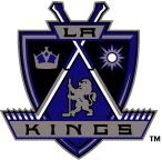
7. Los Angeles Kings
Remember when the Kings brought hockey out West? Gretzky, hollywood, the land of the stars? The silver-and-black was cool and bad-ass. It was tight enough for gangsta rappers to don hockey gear. The cheesy lines and italicized K-I-N-G-S denoted speed, and the crown was befitting of hockey royalty. But, alas, it was not to be. Apparently, this crap is deemed regals...all hail, wait, are these the Sacramento Kings or LA Kings? Is that the Kings family crest? Does anyone care either way?
6. Sacramento Kings
A basketball with a crown atop it? F-in brilliant! No? Oh, sure, add some needless purple a few swords, trumpets and who-knows-what else. It all looks like a graffiti project gone horribly wrong. We hate it. Hate. It.
5. Cleveland Cavaliers
It seems every time I see a Cavs highlight they're rockin' one of what seem to be at least 17 alternate jerseys. This squad has a schizophrenic history when it comes to its on-court attire. We're still feeling the Craig Ehlo, Ron Harper, Mark Price heyday unis with the orange-and-white only. Solid.
4. Milwaukee Bucks
Alright, this one is kinda of a joke. I'm not really advocating that Milwaukee head back to their old-school 80s duds. I mean, this ain't the hottest of get-ups. That said, I think in this day in age having a homosexual animal as your mascot is an idea whose time has come.
3. San Diego Padres
This...this...this thing pictured above is a disgrace. Looks like it should be the logo for Sandals or some other all-inclusive resort. It shouts to free agents. "Come play for us, we're by the ocean and the weather's always gorgeous!" Oh yes, we also have a baseball team and have been competitive a few times in the past couple decades. You never know! I know, it's not like it's been a storied history in terms of logos and unis for San Diego. But at least the old logo of the Pads featured, well, a Pad.
2. Denver Broncos
Tom Jackson. Elway. Sammy Winder. The Orange Crush. Mecklenburg. Those are the Broncos I recall. And they all wore this awesome helmet. A regal-looking Bronco rearing its head from the center of a strong and imposing D - for Denver, for Defense, for whatever. I've never liked the new-fangled Broncos uniforms in any way shape or form. So there.
1. Toronto Blue Jays
We mentioned this last year when the Jays rocked the George Bell-era powder blues. They really are quite spectacular. If you're the Blue Jays, having a whole lot of blue in your uniforms makes a lot of sense. Dig the two-tone cap. Love the realistic Blue Jay in the middle of the jersey. No reason o make the Jay look more millennium, angry and tinged with black. None whatsover. In fact, it's a giant load of crap.
So, opinionated readers, what say you?
Labels:
Weird
![]()


No comments:
Post a Comment